Explainer nitrogen-sensitive nature
A redesign of the data visualisations I made in 2023 for NRC (see below) about the nitrogen crisis in the Netherlands. In this redesign I emphasise the difference in nitrogen sensitivity per type of nature and show how those limits are exceeded in many areas. Using a small nature reserve, I show that each type of nature has its own nitrogen capacity — and the smaller that capacity, the faster it is exceeded. The 3D form I chose makes this visible.
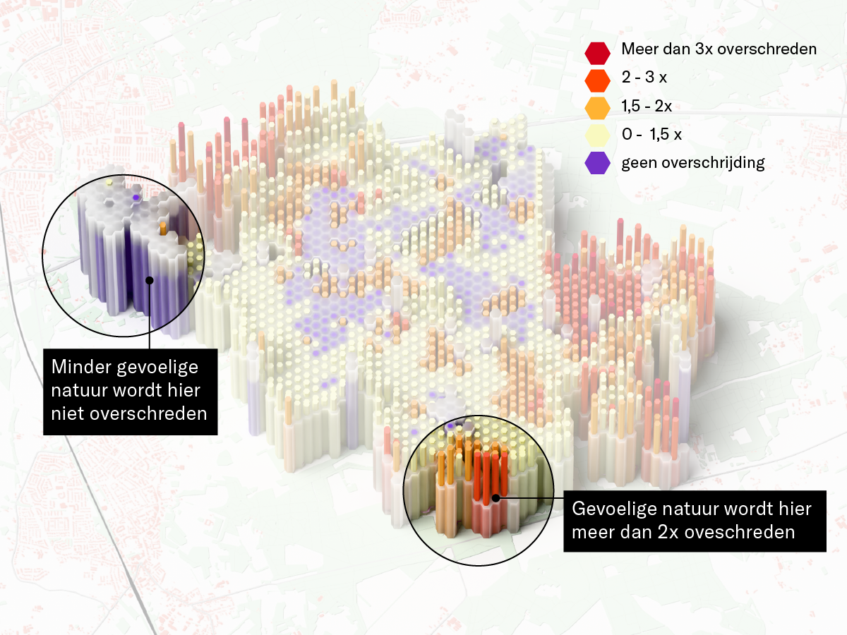
Graphic showing that nitrogen-sensitive nature becomes overloaded faster using a 3D visualisation
Animation showing how it is determined when the nitrogen standard is exceeded
With Wiersma's plan emissions could nearly double
At the end of 2025 the Dutch government wanted to relax the nitrogen threshold and make small expansions by livestock farmers permit-free. I visualised the effect of raising this nitrogen threshold: seemingly small expansions per farm together lead to a large increase in emissions and pressure on nature areas.

Main image for article on FTM
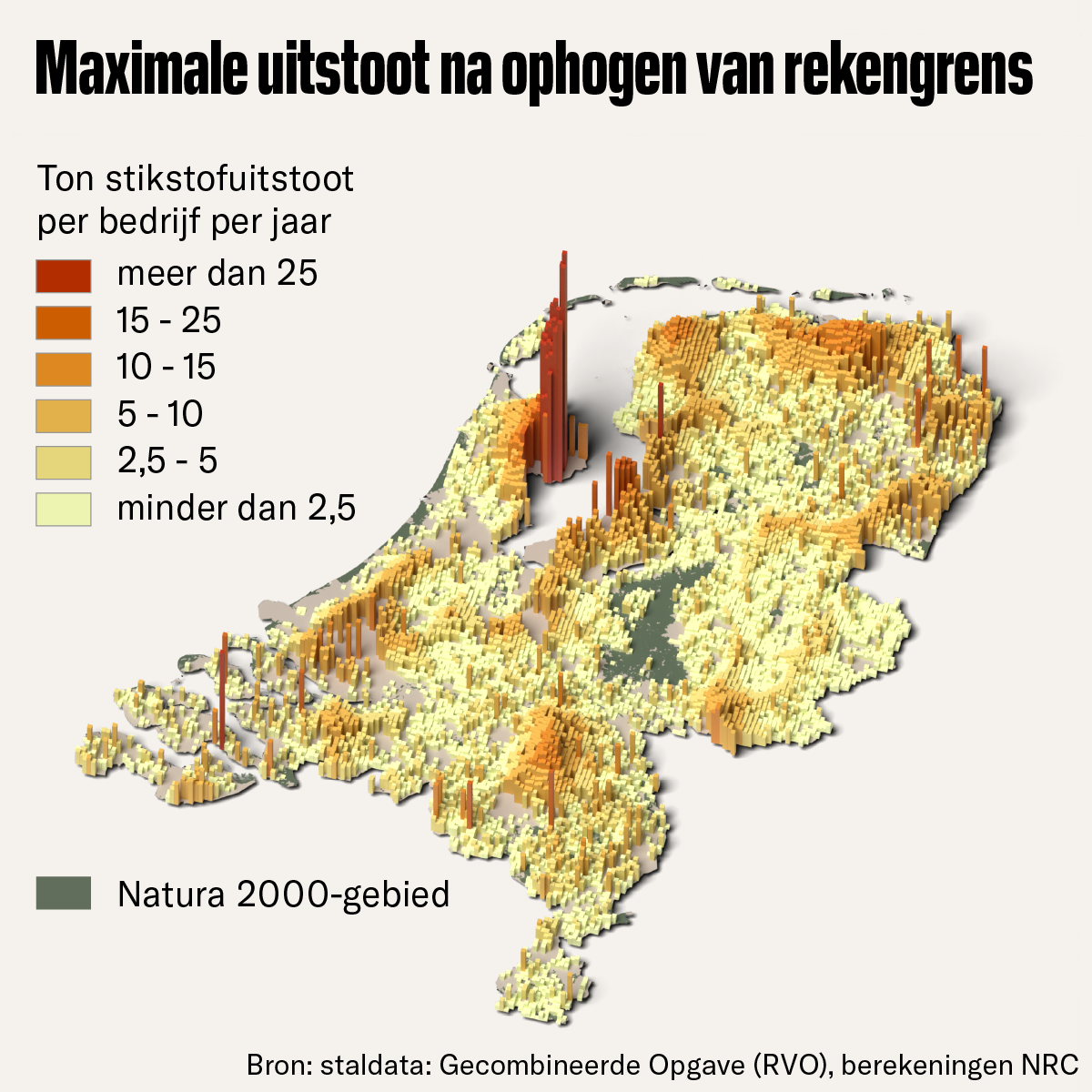
3D visualisation of maximum emissions
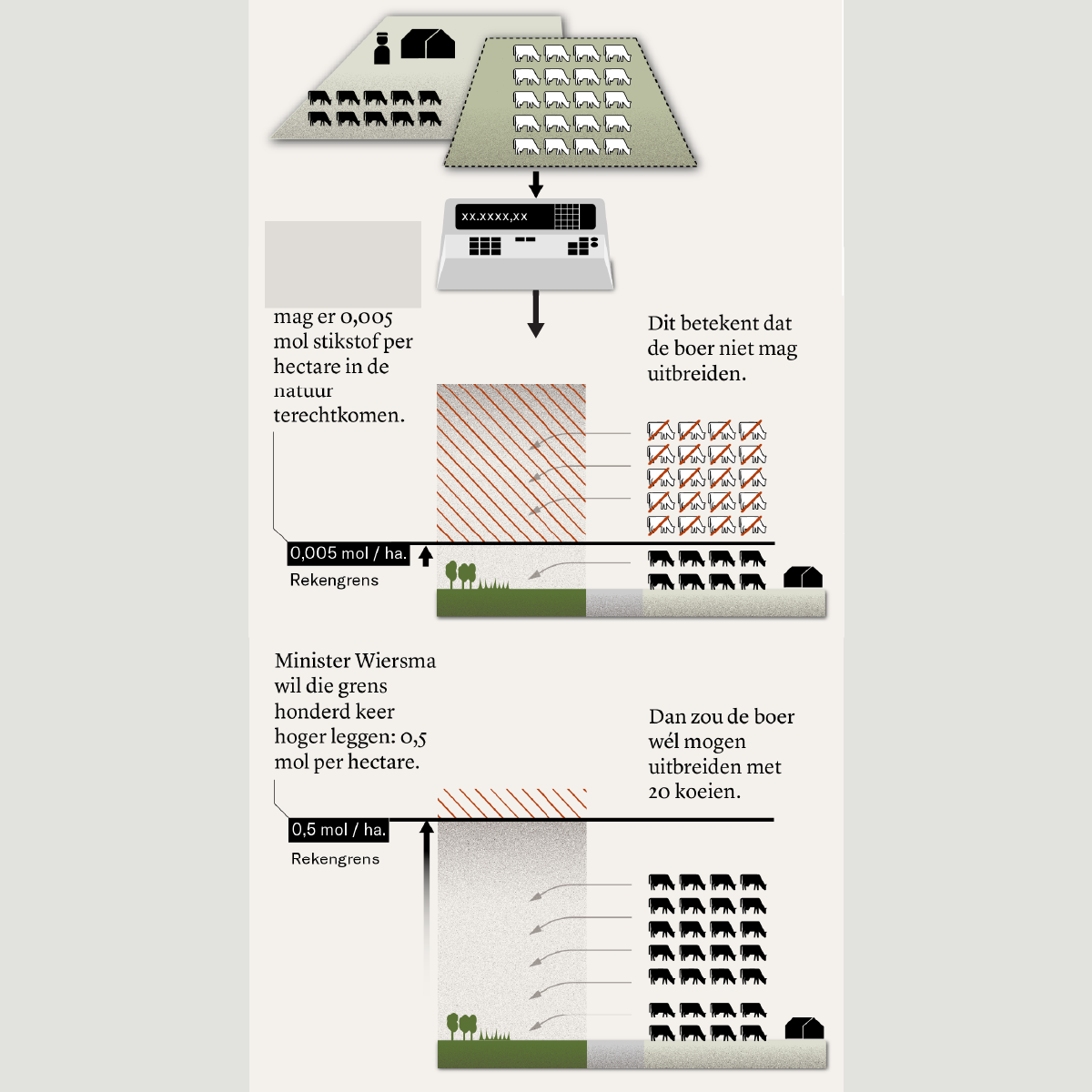
Infographic explaining what raising the calculation threshold means.
From hexagon to peak emitter
The nitrogen crisis — how does it actually work? By running calculations myself using the Aerius model (which the government uses to determine nitrogen deposition) we were able to explain this clearly at NRC. Where are standards being exceeded? How is it calculated where nitrogen emissions end up from the source? And where are the biggest peak emitters? Because I was able to analyse the data myself I could give clear visual form to the story. This project was later featured in a short video about the makers of NRC.
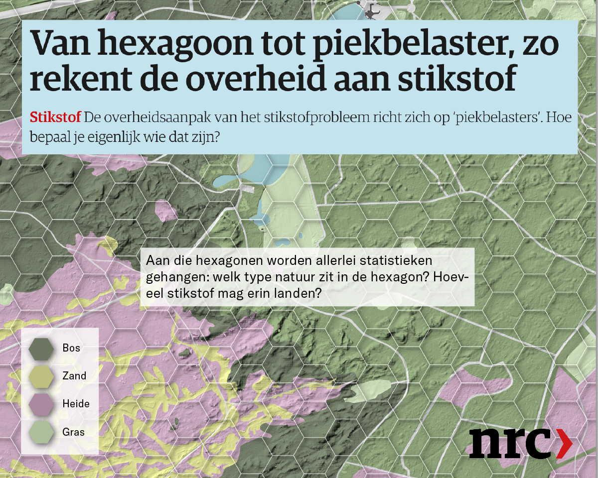
NRC visualisation: explainer on how the government calculates nitrogen
Visualisation of nitrogen emissions based on own calculations
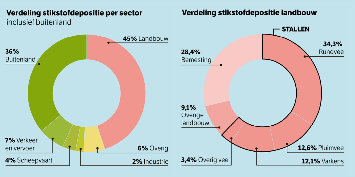
Graphic representation of agriculture's influence on nitrogen
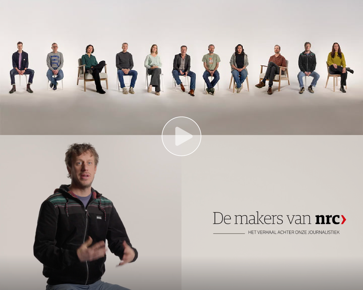
Here I talk about this project in the NRC makers video.